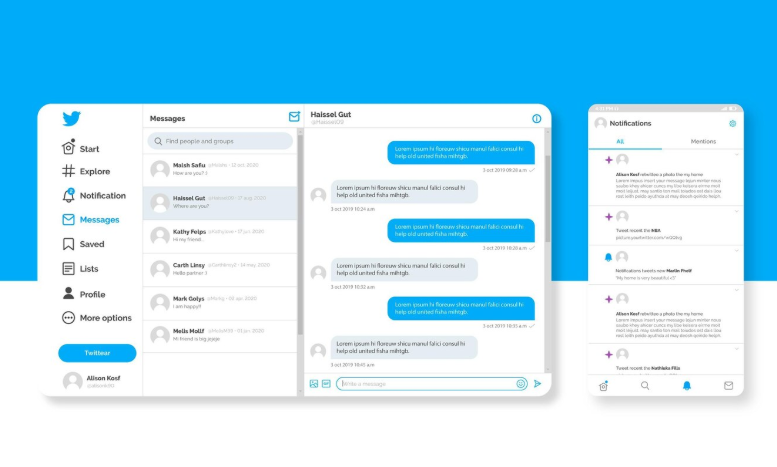
After being criticized for its awkward landscape design, Google Messages is now getting a significantly better makeover that adds much-needed symmetry to its sideways view. The arrangement has long been regarded as visually startling by users who regularly tilt their phones horizontally, whether on tablets or larger screens. It frequently felt like looking into a funhouse mirror because of the lopsided separation between the message list and conversation pane, with one side taking up an oddly disproportionate amount of screen space.
A remarkably effective fix that leveled the visual field and made it possible for each side to share screen space more fairly has been visible in the app’s beta version in recent days. Although this change might not seem like much, it significantly improves readability and usability for everyday users, especially when multitasking or using a device in landscape mode, such as an Android tablet or foldable phone.
| Feature Area | Previous Behavior | New Implementation (Beta) | Reference |
|---|---|---|---|
| Landscape Layout | Chat screen wider than message list | Equal space distribution between conversation pane and message list | Android Authority |
| RCS PDF Preview | No PDF previews, even for short files | Preview of the first page of PDFs (except password-protected ones) | |
| Action Button Labels | Icons only, requiring guesswork | Icons now accompanied by text labels (call, video, contact info, search) | |
| Visual Clarity | Overwhelming spacing issues in horizontal view | Exceptionally clear and balanced layout that reduces cognitive load | |
| Accessibility | Visually unbalanced, difficult for new or older users | Particularly beneficial for landscape typers, seniors, and those with vision needs |
In addition to addressing a small display issue, Google is reaffirming its dedication to careful design by subtly releasing this redesign in its beta version. Regaining user attention and restoring the intuitiveness of digital communication were the goals of interface balancing, which went beyond simple symmetry. This shift is especially crucial now that screen flexibility is necessary for communication, streaming, and hybrid work.

The update also adds PDF previews for RCS chats through thoughtful changes. Convenience and visual context are becoming increasingly important, as evidenced by this addition. Until now, PDFs were sent without previews, so they basically required blind clicks, unlike images or videos. The app imitates a feature that has already shown itself to be incredibly successful on WhatsApp by enabling users to view the first page of a document directly in the conversation window. This modification allows for faster triage without opening a new screen, which is particularly helpful during business chats or conversations involving a lot of documents.
Another considerate addition to Google Messages during the same redesign was the addition of text labels beneath the main action icons. Tech-savvy users might find these additions unnecessary. However, this improvement is especially novel to many, particularly those who are not familiar with interface iconography. It makes the experience more in line with what users anticipate from desktop platforms, where labels and easy navigation are crucial.
These updates seem appropriate when considering cross-device compatibility. Applications need to adjust to new behaviors as more users switch to larger screens and dual-screen phones. The market for foldable phones, which is led by devices like Google’s Pixel Fold and Samsung’s Galaxy Z Fold series, has put more pressure on apps to function flawlessly in all orientations. A lopsided layout is no longer acceptable, particularly in light of rivals like Telegram and iMessage continuously improving their interface logic.
This solution can expedite engagement for digital creators and influencers, particularly those in charge of managing live chats with clients or fans. Consider a journalist switching between chats and shared files, or a TikTok creator organizing a brand collaboration. Previewed documents and balanced layouts provide clarity, which turns into an efficiency tool rather than just a politeness.
Google has been steadily improving the RCS framework over the last few months in an effort to make its Messages app a viable substitute for iMessage. This update is strategic groundwork rather than merely cosmetic refinement. From novice smartphone users to corporate power users, the platform gains appeal by simplifying interactions, lowering friction, and increasing visibility.
This action provides a case study of subtle yet incredibly effective improvements for early-stage app designers. The interface was not completely revamped by Google with gaudy animations or overly complicated transitions. Rather, it concentrated on the important details—visibility, proportion, and ease of use. This update feels naturally intelligent—purposefully calibrated for practical use, much like a swarm of bees naturally arranges itself to maximize movement.
The wider ramifications extend beyond a single app. An industry standard is set when a tech behemoth like Google gives accessibility and layout coherence new attention. Others pay attention, whether it’s bigger platforms like Apple and Meta planning their upcoming incremental updates or smaller messaging apps looking to gain traction. Every change pushes the entire app ecosystem in the direction of more considerate digital ergonomics.
Apps that change with user behavior are usually the most resilient—those that continue to be used across several tech eras. Update after update, Google Messages is demonstrating its intention to be one of them. Additionally, this fix has greatly lessened one of the last remaining annoyances that users have voiced in the past 12 months.
By incorporating these user-friendly updates and implementing them with quiet assurance, Google is indicating a highly adaptable level of design maturity. The business is reacting with meticulous recalibration, one PDF preview and icon label at a time, rather than merely listening.
